Musical Sound Design for Installations
Posted: April 12th, 2018 | Author: Nathan | Filed under: interactive audio, sound design, theory![Want a challenge? Try to play back interface sounds on the show floor at CES. [Intel Booth, CES 2012.]](https://noisejockey.net/blog/wp-content/uploads/2018/03/musicalSDI-03.jpg)
Want a challenge? Try to play back interface sounds on the show floor at CES. [Intel Booth, CES 2012.]
In my experience, there are several reasons for this. [All photos in this post are projects that I creative-directed and created sound for while I was the Design Director of Stimulant.]
Expectations and Existing Devices
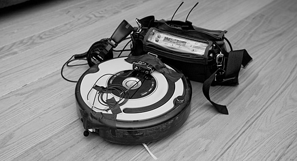
It’s what people expect out of computing devices. The computing devices that surround me almost all use musical tones for feedback or information, from the Roomba to the XBox to Windows to my microwave. It could be synthesized waveforms or audio-file playback, depending on the device, but the “language” of computing interfaces in the real world have been primarily musical, or at least tonal/chromatic. This winds up being a client expectation, even though the things I design tend not to look like any computer one uses at home or work.

Yes, I strapped wireless lavs to my Roomba. The things I do for science.
Devices all around us also use musical tropes for positive and negative message conveyance. From Roombas to Samsung dishwashers, tones rising in pitch within a major key or resolving to a 3rd, 5th, or full octave are used to convey positive status or a message of success. Falling tones within a minor key or resolving to odd intervals are used to convey negative status or a message of failure. These cues, of course, are entirely culture-specific, but they’re used with great frequency.
The only times I’ve ever heard non-musical, actually annoying sound is very much on purpose and always to indicate extremely dire situations. The home fire alarm is maybe the ultimate example, as are klaxons at military or utility installations. Trying to save lives is when you need people’s attention above all else. However, even excessive use of such techniques can lead to change blindness, which is deep topic for another day. Do you really want a nuclear engineer to turn a warning sound off because it triggers too often?
The Problem with Science Fiction
Science fiction interface sounds often don’t translate well into real world usage.
![This prototype "factory of the future" had to have its sound design elevated over the sounds of compressors and feeders to ensure zero defects. [GlaxoSmithKline, London, England]](https://noisejockey.net/blog/wp-content/uploads/2018/03/musicalSDI-05.jpg)
This prototype “factory of the future” had to have its sound design elevated over the sounds of compressors and feeders to ensure zero defects…and had to not annoy machine operators, day in and day out. [GlaxoSmithKline, London, England]
Audio for these cinematic interfaces – what Mark Coleran termed FUI, or Fantasy User Interfaces – may be atonal or abstract so that it doesn’t fight with the musical soundtrack of the film. If such designs are musical, they’re more about timbres than pitch, more Autechre than Arvo Part. This just isn’t a consideration in most real-world scenarios.
Listener Fatigue
Digital installations are not always destinations unto themselves. They are often located in places of transition, like lobbies or hallways.
I’ve designed several digital experiences for lobbies, and there’s always one group of stakeholders that I need to be aware of, but my own clients don’t bring to the table: The front desk and/or security staff. They’re the only people who need to live with this thing all day, every day, unlike visitors or other employees who’ll be with a lobby touchwall for only a few moments during the day. Make these lobby workers annoyed and you’ll be guaranteed that all sound will be turned off. They’ll unplug the audio interface from the PC powering the installation, or turn the PC volume to zero.
![This lobby installation started with abstract chirps, bloops, and blurps, but became quite musical after the client felt the sci-fi sounds were far too alienating. [Quintiles corporate lobby, Raleigh NC]](https://noisejockey.net/blog/wp-content/uploads/2018/03/musicalSDI-01.jpg)
This lobby installation started with abstract chirps, bloops, and blurps, but became quite musical after the client felt the sci-fi sounds were far too alienating. Many randomized variations of sounds were created to lessen listener fatigue. There was also one sound channel per screen, across five screens. [Quintiles corporate lobby, Raleigh NC]
Randomized and parameterized/procedural sounds really help with listener fatigue as well. If you’re in game audio, the tools used in first- and third-person games to vary footsteps and gunshots are incredibly important to creating everyday sounds that don’t get stale and annoying.
The Environment
Another reality is that our digital experiences are often installed in acoustically bright spaces, and technical sounding effects with sharp transients can really bounce around untreated spaces…especially since many corporate lobbies are multi-story interior atriums! A grab bag of ideas have evolved from years of designing sounds for such environments.
![This installation had no sound at all, despite our best attempts and deepest desires. The environment was too tall, too acoustically bright, and too loud. Sometimes it just doesn't work. [Genentech, South San Francisco, CA]](https://noisejockey.net/blog/wp-content/uploads/2018/03/musicalSDI-04.jpg)
This installation had no sound at all, despite our best attempts and deepest desires. The environment was too tall, too acoustically bright, and too loud. Sometimes it just doesn’t work. [Genentech, South San Francisco, CA]
The only consistently effective trick I’ve found for creating sounds that punch through significant background noise is rising or falling pitch, which lends itself nicely to musical tones that ascend or descend. Most background noise tends to be pretty steady-state, so this can help a sound punch through the environmental “mix.”
One cool trick is to sample the room tone and make the sounds in the same key as the ambient fundamental – it might not be a formal scale, but the intervals will literally be in harmony with one another.
Broadband background noise can often mask other sounds, making them harder to hear. In fact, having the audio masked by background noise if you’re not right in front of the installation itself might be a really good idea. I did a corporate lobby project where there was an always-running water feature right behind the installation we created; since it was basically a white noise generator, it completely masked the interface’s audio for passersby, keeping the security desk staff much happier and not being intrusive into the sonic landscape for the casual visitor or the everyday employee.
Music, Music Everywhere

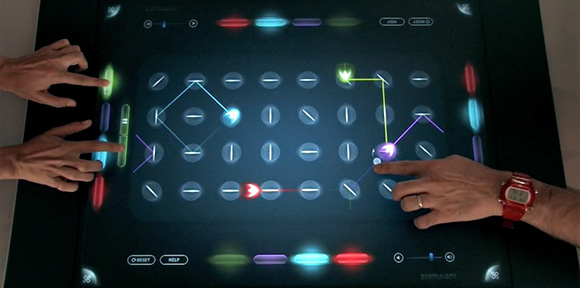
Of course, sometimes an installation is meant to actually create music! This was the first interactive multi-user instrument for Microsoft Surface, a grid sequencer that let up to four people play music.
These considerations require equal parts composition and sound design, and a pinch of human-centered design and empathy. It’s a fun challenge, different than sound design for traditional linear media, which usually focuses on being strictly representative or on re-contextualized sounds recorded from the real world. Listen to devices around you in real life and see if you notice the frequency (pun intended) with which musical interface sounds are commonplace. If you have experiences and lessons from doing this type of work yourself, please share in the comments below.
Tags: music, sci-fi, sound design, sound effects | No Comments »
Leave a Reply